News•November 7, 2013
NOAA's New Cool Tool Puts Climate on View for All

By Brian Kahn
Sifting through the massive amount of climate and weather data collected by the National Oceanic and Atmospheric Administration (NOAA) can be daunting. However, a new tool released Tuesday brings that data to the masses and with a few clicks of the mouse or taps on the screen, creates interactive maps that clearly show natural and manmade shifts in the climate and oceans around the world.
The National Climatic Data Center alone contains over 6 petabytes of data. That’s enough data on ocean and land temperatures, cloud cover, rainfall, and other climate and weather indicators to fill more than 49,000 hard drives in the beefiest iPad Air. Other NOAA data centers house still more information on Arctic sea ice, the deep ocean, fisheries, and climate projections collected from satellites, weather stations, buoys, ocean sounds and computer models.
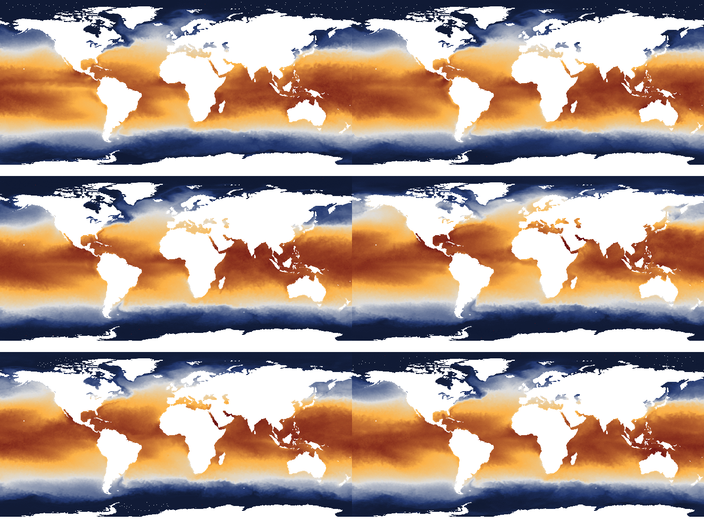
An animation made in NOAA View showing monthly shifts in sea surface temperatures around the globe.
Credit: NOAA

Most of that data is free and publicly available. However, just because it’s available doesn’t mean it’s centralized or intuitive to access, let alone figure out what to do with it once it’s on your desktop. NOAA's new effort aims to sidestep those issues and let the public explore cloud cover, salinity levels in the depths of the ocean, and everything in between.
The tool, called NOAA View, offers easy access to 60 NOAA datasets that go back to 1880 as well as future climate model simulations. Dan Pisut, who manages NOAA’s Environmental Visualization Program, said the initial datasets were chosen based on the data most accessed by news organizations and museums.
“We wanted to build something where somebody that doesn’t want to crunch all the numbers can still see an image,” Pisut said. “After all, an image is worth a thousand words.”
To get those images, users can browse datasets by category and time period. Behind the scenes, hundreds of computer programs churn that data into beautiful maps that can show variables for a specific period or how they change over time.
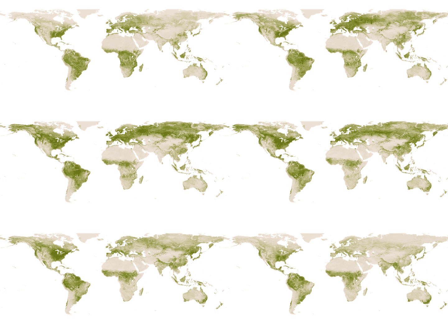
An animation made in NOAA View showing weekly changes in vegetation from May 2013 through October 2013.
Credit: NOAA

“The datasets I find really interesting are the ones that have a long span of time so you can see changes, whether they’re linear or cyclical changes,” said Pisut, referencing global surface temperatures, which have risen steadily since 1880 as well as sea surface temperatures that show the cyclical nature of El Niño and La Niña in the tropical Pacific.
The future is also on display, with projections from the latest climate models included in the data.
NOAA View took inspiration from other data visualization tools already online while adding its own twist. Pisut said NASA’s Earth Observations tool was particularly inspirational, but that they wanted to make NOAA View’s animations more smooth and easily downloadable. NOAA View also works on tablets and smartphones, which now account for 44 percent of all hours the U.S. population spends on the computer.
The 60 datasets are only a fraction of what NOAA has in its archive, but the number will grow in the future, especially as new observations come online.
“One thing we’re really looking to do over the next couple years is include data from the Suomi-NPP satellite,” Pisut said, referring to a satellite named after Verner Suomi, the father of satellite meteorology, operated jointly by NASA and NOAA. “There’s a stark contrast from our predecessor satellites to the Suomi-NPP. in some cases the data resolution quadruples.”
Related Content
Breathtaking Coral Reef Panoramas Help Scientists
Interactive Look at Top 11 Indicators of a Warming World
Exhibit Turns Climate Data into Artistic Experience
Data Storm: What to do with All this Climate Data?
'Forest People' Can Gather Necessary Climate Data
