News•May 8, 2014
Can We Talk About the New NCA Website?

By Brian Kahn
This week’s release of the National Climate Assessment, which chronicles in painstaking detail how climate change is affecting the U.S., is a far cry from what most expect when they hear the words “government report.” The NCA represents the first major digital release of a federal report, one that could be a prototype for all future reports.
Screenshot of the silent looping video that introduces the chapter on extreme weather.

The new assessment reflects the immersive digital experience most people expect in 2014. The site is beautifully designed, easy to navigate, and dare we say, modern. A silent looping video of palm trees whipping in the wind introduces a chapter on extreme weather, and interactive graphics abound, allowing users to delve into key climate change indicators in as much detail as they want. And you can actually look at it on a cell phone without squinting or wanting to smash your screen in frustration. It’s a far cry from slogging through static pages or links to PDFs.
For lovers of print, yes, you can still download a hard copy of the entire 840-plus page report, But for the vast majority of Americans, that holds about as much appeal as standing in line at the DMV.RELATEDU.S. Climate Change Report Warns of Regional Impacts
Climate Change in the U.S. in 8 Compelling Charts
White House Brings Together Big Data & Climate Change
Chris Weaver, the deputy director of U.S. Global Change Research Program (USGCRP) that administers the report, said he and the report’s lead authors were keenly aware of that when they started their planning 4 years ago. While the scientific research that went into it was critical, so was ensuring the report found a broader audience.
“We want people to share findings and knowledge that’s in the report with their peers. The main way people do that today is through social media.” Weaver said. “Even in 2009, the last time we put out an assessment report, they didn’t do that to the degree they do today.”
The new site, designed by numerically named private sector firms Habitat Seven and Forum One, contains individual URLs for every section and image for easy sharing. Twitter and Facebook share buttons also make it easy to send it ping-ponging around the Web. It’s a site designed for virality (aside from its lack of cat pictures).
The NCA site sports a responsive design, which adapts it for both mobile and tablet screens in addition to traditional laptop and desktop screens. That’s of particular importance since as of the first quarter of 2014, mobile and tablet users now account for nearly a third of all web browsing according to a recent report.
All in all, it's a home run. Of course, as Weaver said, joking, “the government website bar is pretty low after healthcare.gov.” Still, the slick nature of the new NCA site stands out for its beauty, functionality and simplicity.
“We’re just starting to understand the possibilities,” Weaver said. “There’s so much more we can do with this, connecting information to people who want to get it.”
This report stands in contrast to the release of the latest Intergovernmental Panel on Climate Change report. The IPCC is an international group of scientists that puts out the global version of the NCA report roughly every 6 years. Their approach has often been criticized as stodgy and less than user-friendly. A number of scientists contribute to both reports, but whether the IPCC takes a more web-savvy approach with future reports remains to be seen.
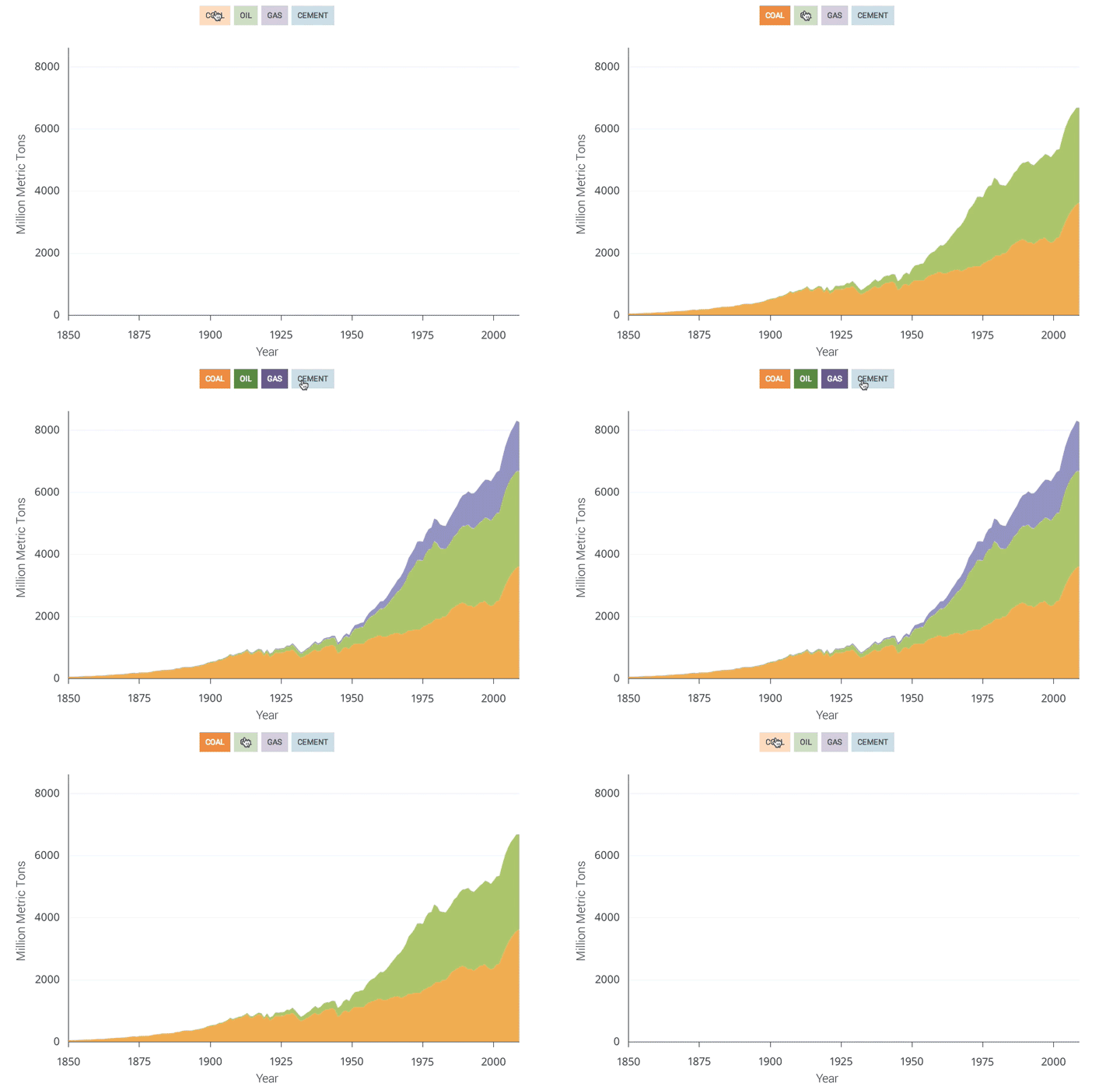
Of course the next IPCC is years away. In the meantime, go check out the NCA for your full dose of spiffy graphics like this one:
U.S. Carbon dioxide emissions by source.

Editor's Note: This story has been updated to reflect Chris Weaver's title.
You May Also Like
John Allen: Scientist with an Eye on the Storm
U.S. Climate Change Report Warns of Regional Impacts
Climate Central at White House for NCA Launch
The Meteoric Rise of Carbon Dioxide in 1 Video